- The Basic Principles of Logo Design - This websites discusses how to design a logo, keeping in mind things like simplicity, originality, and versatility. It gives examples of good and bad logos, recommending to have second opinions on your logo just incase it looks like something you didn't want it to.
- Common Mistakes in logo design - This website made a great point about relying on color for a great logo. The artist must keep in mind that sometimes their logo will need to be printed in black and white and therefore shapes are necessary. Additionally, font choice can make or break a logo.
- 38 Cool Logos - While searching for inspirational logos I came across this webpage. I really like the illusions in these logos.
- Logo Tutorial - This is a logo tutorial showing how to use pictures from the internet (that you trace) and font choice the create a nice logo.
- 3D Logo Tutorial - This tutorial shows how to create 3D logos. Depending on in which direction I plan to go this might be a good resource.
- Yet Another tutorial, - I really like the complex simplicity of this one (if that makes sense). If I were to use this I would have to be careful of relying too much on color so it could go either way.
Wednesday, November 10, 2010
Logo design research
Here are some good logo design websites i've found
Wednesday, November 3, 2010
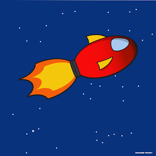
Spaceship Tutorial
Tutorial Description: I made this with the help of the spaceship tutorial from denisdesign.net and used the information I learned from victordiary.com tutorials. It took me three classes plus an extra one class to make the sky in the background.
New Skills, Processes & Tools Learned:
Tools: pathfinder tool, stroke tool, & opacity tool
Self Reflection: I am pleased with how my spaceship came out. I think the shapes look well-proportioned and i like the colors. I like what i did with the sky in the background. I drew five constellations with the star shape tool. At the top left I drew the big dipper, below that, in the bottom left, I drew Orion, and then in the bottom right I drew the little dipper. These I drew because they are the ones that I am most familiar with. Then i drew pegasus in the top right and The archer in the right center because unlike most constellations, I actually see the shapes.
Part/Proj: 10/10
Subscribe to:
Posts (Atom)
